
INSIGHTS

Ask These 10 Questions to Know If You Are Working with the Best Interior Design Company in Saudi Arabia
Choosing the right interior design partner in Saudi Arabia can make the difference between a seamless project and costly delays. In this post, we outline 10 essential questions to ask any prospective firm—covering everything from their design philosophy and permit-handling expertise (SABER, Civil Defense, SCE registration) to their project management, 3D visualization capabilities, and cultural insights. By evaluating how a company approaches budgeting, quality control, and warranty support, you’ll quickly see which teams have the local know-how and proven track record to bring your vision to life—whether it’s a luxury villa in Riyadh, a boutique café in Jeddah, or a modern office in Dammam. Use this checklist to confidently identify the best interior design company in Saudi Arabia and avoid hidden pitfalls before breaking ground.
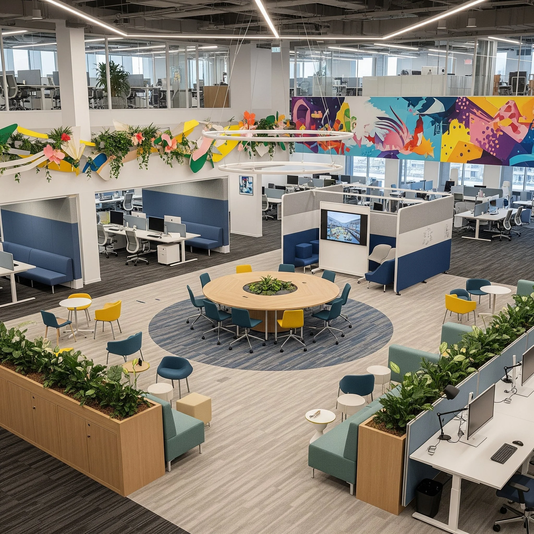
Revolutionizing the Workspace: The Power of Strategic Office Interior Design
Unlock the power of expert office interior design for your business. Learn about modern trends like biophilic design and flexible workspaces shaping offices in Qatar and Saudi Arabia
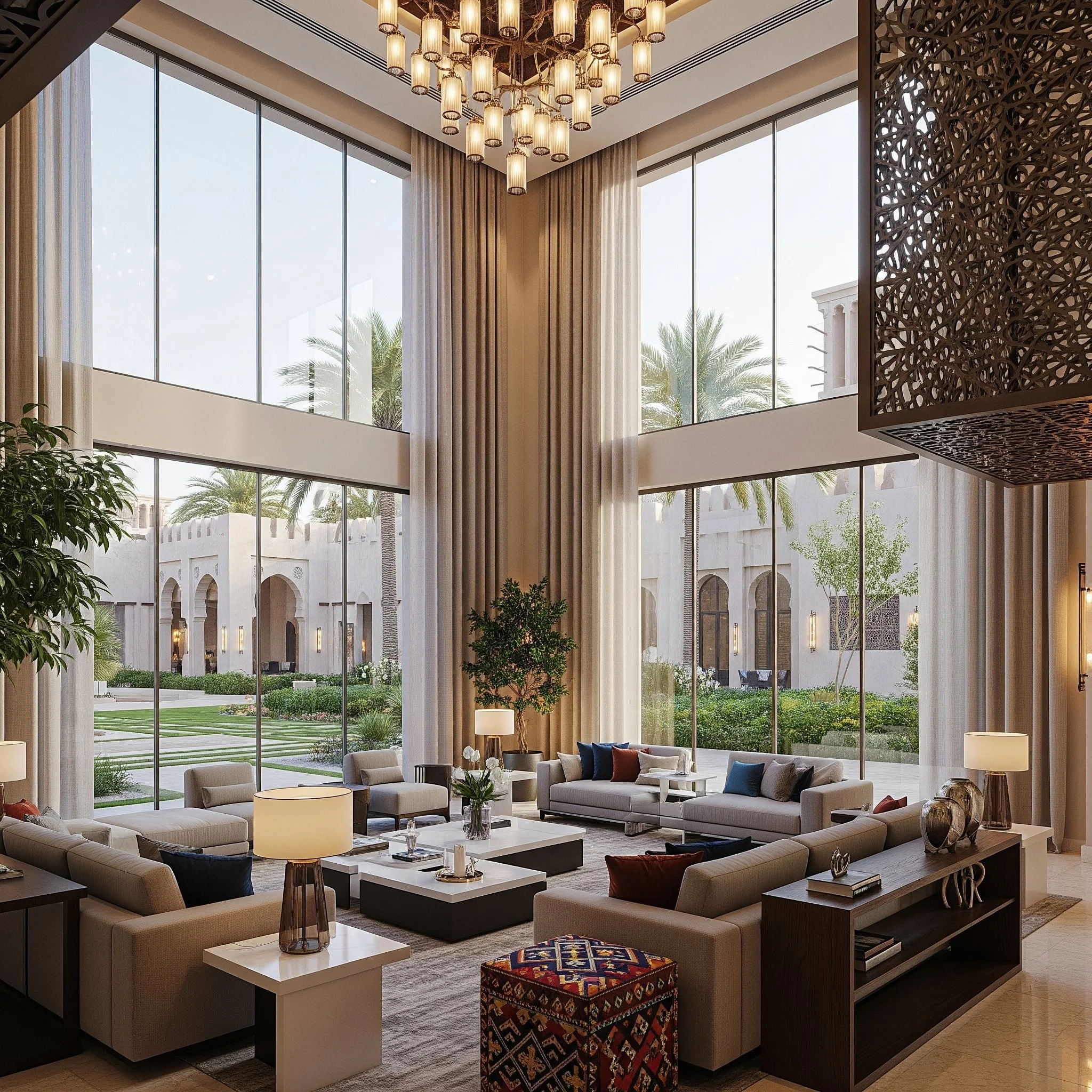
Affordable Luxury Villa Design in Doha: Creating Stunning Spaces Without Breaking the Budget
The foundation of affordable luxury begins with smart design principles that maximize impact while minimizing unnecessary expenses. Efficient space planning is perhaps the most crucial element in this approach.
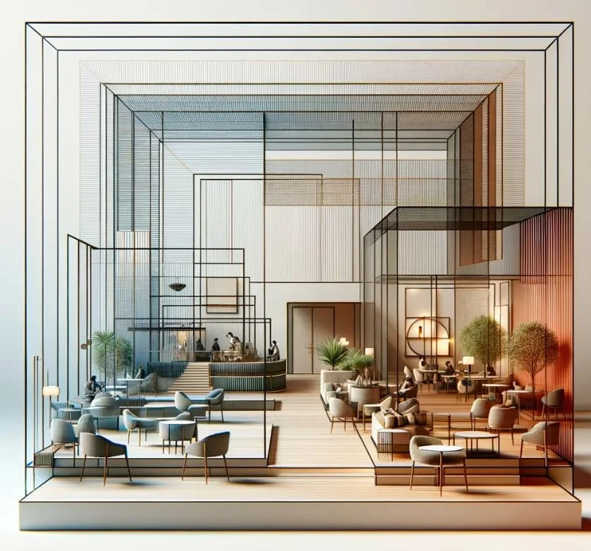
Key Components of 3 Star Hotel Design
In the realm of hospitality design, 3-star hotels hold a unique position. They bridge the gap between the affordability of budget accommodations and the luxury of higher-starred establishments, aiming to provide guests with a comfortable, functional, and aesthetically pleasing environment.
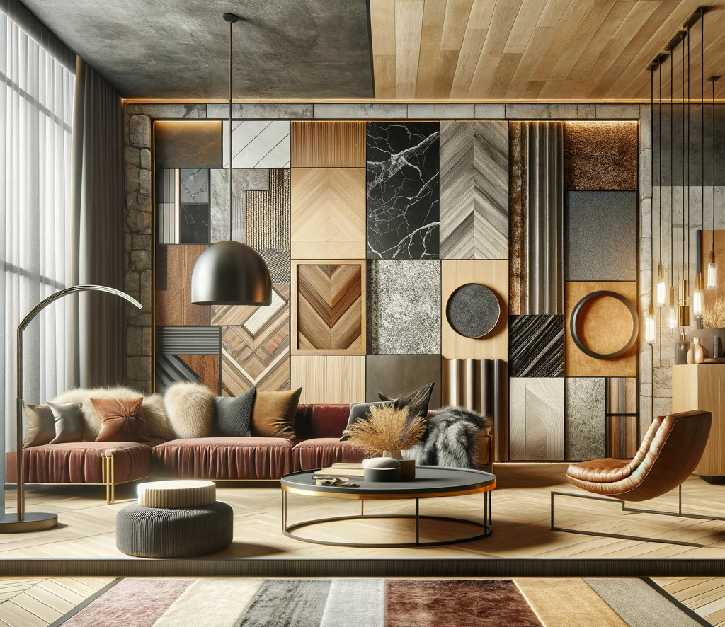
Embracing Eclectic Material and Texture Mix
In the constantly evolving world of interior design, the blend of diverse materials and textures has emerged as a paramount trend, transforming ordinary spaces into rich tapestries of visual and tactile delight.
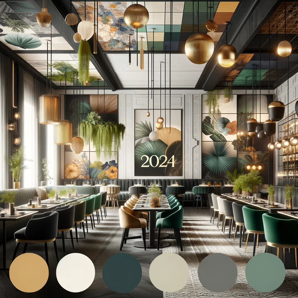
Top Color Trends in 2024 Restaurant Design
Welcome to 2024, a year where the art of color in restaurant interior design is not just about aesthetics but about creating an atmosphere that complements the culinary experience.
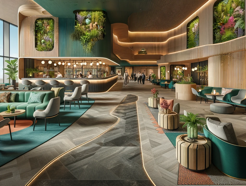
2024 Hospitality Interior Design Trends
As we navigate through 2024, the hospitality industry is witnessing a seismic shift in its interior design trends.

What to Expect from an Interior Designer
Whether you’re involved in a large-scale design project or simply looking to transform an existing space into a new experiential level, making sound decisions to bring your vision to life can be a challenging
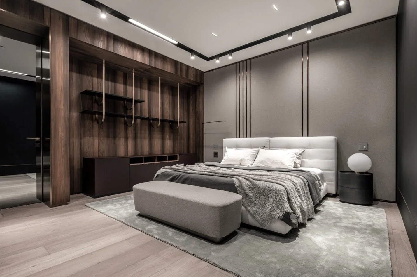
How Smart Bedroom Design Can Improve Your Sleep
Could you name the place where you are spending about one-third of your life? In many ways, there is no space in a house more important than a bedroom. A good night’s sleep can make all the difference the following
Office Design After COVID-19: Six Degrees of Separation
It’s early to say if the New Normal is here to stay. However, life and business will not return to old normal any time soon, so the faster we adapt to changes, the better—and safer. Across the globe, we witness different
9 Best Interior Design Software Programs to Use in 2020
The rapid shift in software technology has enabled interior design professionals worldwide to create floor plans and make building projects run smoothly, quickly, and efficiently. There is a noticeable increase in both premium and free design tools — typically either
Restaurant Renovations and Design Trends That Could Turn Tables in 2020
With the evolving landscape of global travellers and a growing number of people choosing to dine out more, restaurant renovation is booming as the industry seeks to become competitive, efficient and sustainable. Integrating experience-driven design, ambience and menus to create a
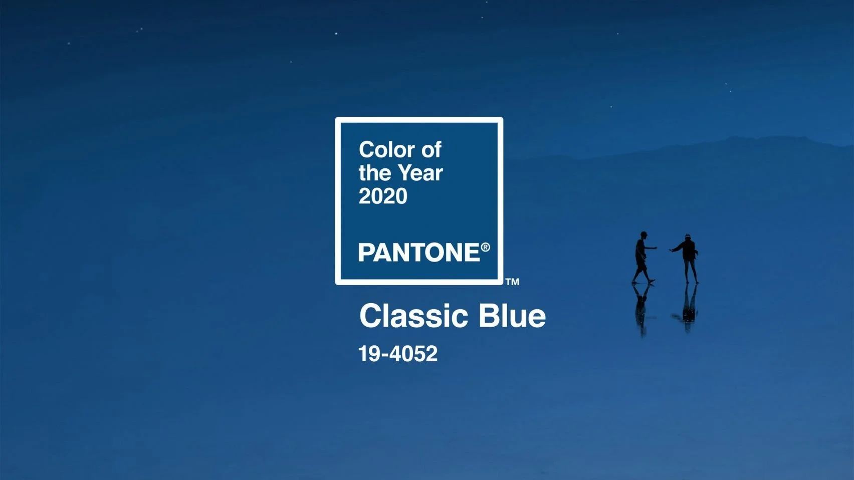
Designing with Pantone 2020 Colour of the Year
Inspired by trends in society, culture, new technology, fashion and travel destinations; colour company Pantone presented the refreshing PANTONE 19-4052: Classic Blue as its Colour of the Year for 2020. Defined as "a timeless and enduring blue hue" that's "suggestive of the sky at